A Creative Muse
Thursday, May 22, 2014
Tag Envelope Tutorial- Using Envelope Punch Board by We R Memory Keepers
Excellent video for creating tag holders using the We R Memory Keepers Envelope Punch Board.
Saturday, November 9, 2013
Nice Video from Scrapbook Expo
The link below takes you to a video about making a bow using a fork! I've gotta give it a try in time for Christmas decorating. I'm not the best bow maker. Hope you enjoy!
Wednesday, August 28, 2013
Saturated Canary Challenge #50!
Winged Things Challenge #50 ~
Cerridwen on a 6X6 Canvas!!!!
Happy Wednesday!!!
I was excited about this challenge as Krista has released some gorgeous fairy images on her Saturated Canary Digi shop! And I recently completed a weekend workshop on textures & canvas with the very talented Anna Dabrowska aka Finnabair! I wanted to apply what I learned to this piece.
I started off with a 6X6 canvas. Applied gesso to create grit. Then added a piece which resembles a birds nest. That's the background. Next, I placed some cheesecloth. And built my layers from there. The pieces are about 1 1/2 inch to 2 inches high from the canvas! I had to use a triple pop dot to attach Cerridwen to the canvas!
Although I decided to enter the challenge because of the new fairy images, I ended up using an older image, Cerridwen, because as I colored, I realized that I wanted to use actual wings! So that prompted my image choice. Next, I took out my Tim Holtz Angel Wing die and made several cuts on glittery paper. I was excited to play with the die actually. I distressed the edges of the wings with Vintage Photo distress ink. Then layered them by using pop dots between each wing piece. It was like building a tiered cake! 😃
Here's a closer look:
And if you're wondering about the watermarks... I've been playing with a watermark app. I can't figure out Photoshop. The time! So I found an app where I just paste my text over the image. One day I'll use a fancy one like my fellow crafters!
Here's a last look at my piece hanging on the wall! She'll be right at home in my craftroom 😊
Have a blessed week!
Labels:
canvas,
Challenge,
Saturated Canary
Wednesday, July 31, 2013
"Glitz & Glamour" ~ Saturated Canary Challenge!
I created this 12X12 canvas layout for the challenge. I had fun playing with the soft colors and paper piecing. My first time doing it. Cutting out the dress wasn't easy, but time passed as I watched tv while doing it.
Most of the papers and embellishments used were Prima....
Here's a closer look. I kept everything delicate and soft. To retain the "Glamour" factor! And not too many touches of bling and sparkle for the "Glitz"!
I hope you enjoy!
Tuesday, July 9, 2013
Monday, July 1, 2013
Saturated Canary Challenge #46!
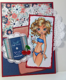
In honor of the 4th of July, I colored this cutie!
And I added a tart cherry to be the fruit for the challenge. Isn't she Summer Cool?
I really liked working with the red, white & blue. So much card making fun!
Have a great week. And a happy 4th!
And I added a tart cherry to be the fruit for the challenge. Isn't she Summer Cool?
I really liked working with the red, white & blue. So much card making fun!
Have a great week. And a happy 4th!
Tuesday, June 18, 2013
Saturated Canary's Lovely Challenge #45
I finished up this cutie last night. I was in Michael's last week and saw this 7 Gypsies frame on sale. And then the inspiration to create my first photo tray and enter it into Saturated Canary's Challenge emerged. I think 'Lovely' was perfect to place in my frame and decorate my craftroom.
I used some little jewelry finds from art-i-cake. I purchased a few on sale at Michael's as well.
I also added a doily and bits of lace throughout to create the look. I used tons of pop dots to add dimension to the project.
Enjoy!
Subscribe to:
Comments (Atom)


